Wimoov, an association under the Groupe SOS umbrella, was established in 1998 and is now composed of 250 employees. Mobility-related professions (such as support, management, and coordination) are the cornerstone of the platforms dedicated to this field. However, these professions often suffer from a lack of professional recognition. To address this, Wimoov created France’s first school dedicated to training individuals in inclusive mobility careers
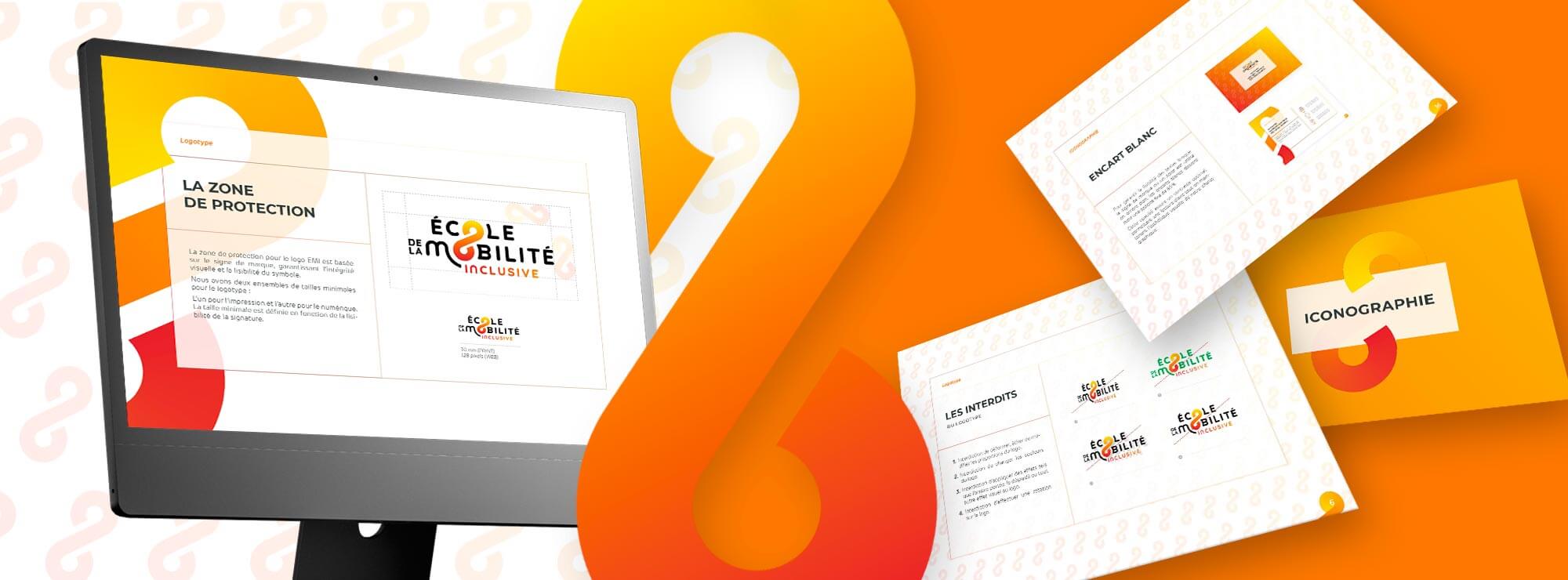
We supported this initiative by crafting a visual identity and communication materials aligned with its core values.
A logo in perpetual motion
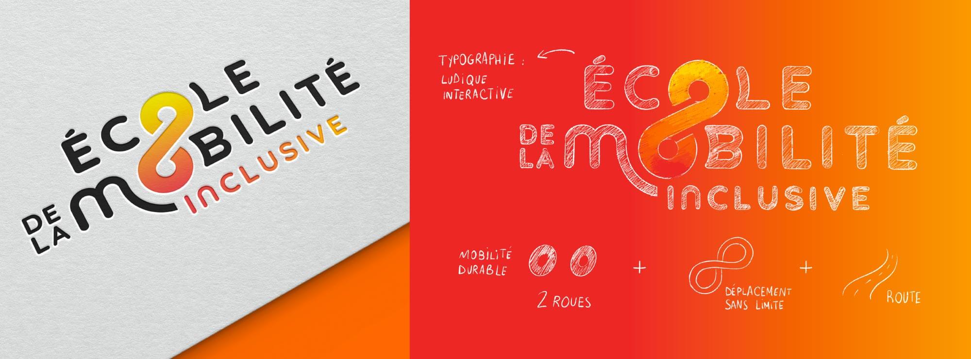
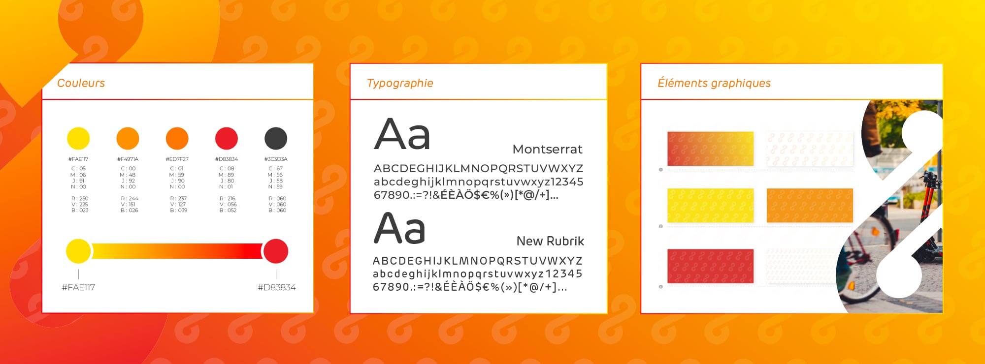
The infinity symbol, crafted using the "O" in the words "école" (school) and "mobilité" (mobility), evokes a road and the idea of unrestricted movement. It also illustrates the goal of fostering sustainable and responsible mobility. This symbol connects with the concept of inclusion, aiming to restore connections for people facing mobility challenges, often marginalized due to their circumstances. The typography is rounded and warm, reflecting the interactive and enjoyable learning experience the school offers. The term "inclusive" is highlighted through vibrant red and orange colors. The overall design is intentionally deconstructed to symbolize the ambition to reshape conventional views of mobility. The rounded forms and colors draw inspiration from Wimoov’s logo to ensure coherence across branding. The logo is dynamic and luminous, thanks to a gradient of yellow, orange, and red hues. The balance between black and the vibrant colors symbolizes a blend of professionalism (as a certifying school) and humanity (optimism, playful learning, communication, and innovation). The chosen typefaces are both simple (sans-serif), friendly, and modern.
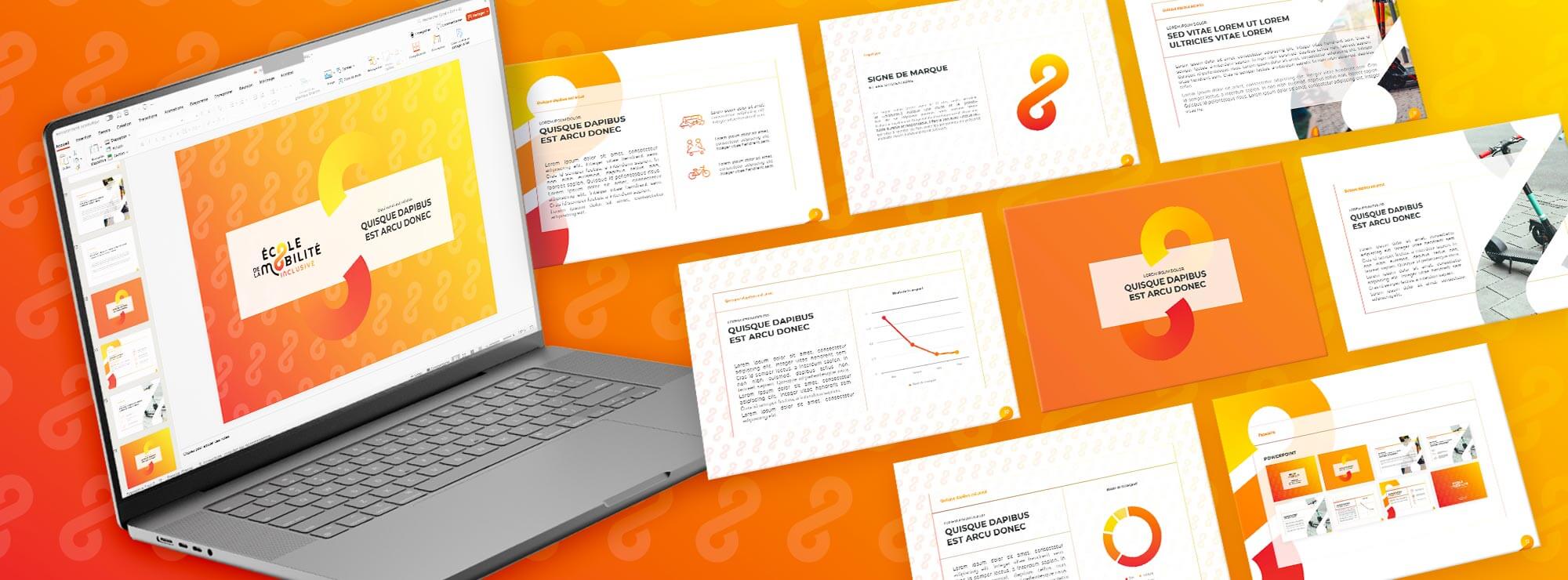
A contemporary and adaptable visual identity
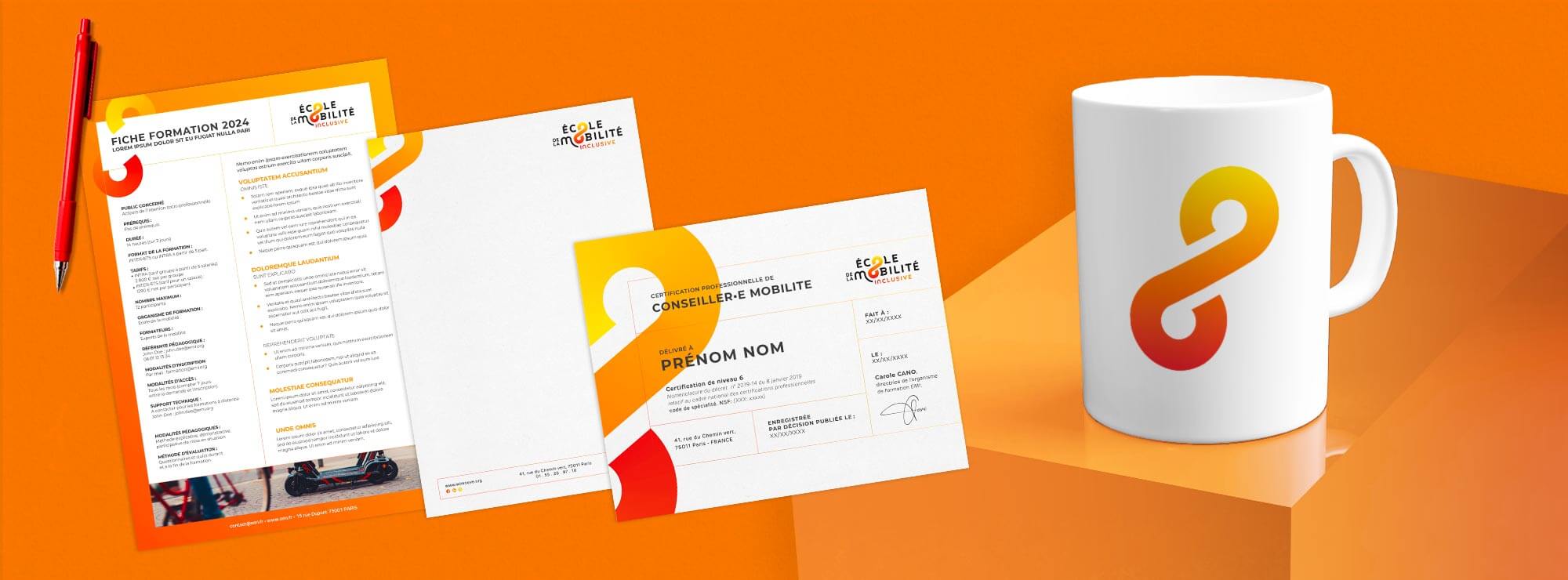
Made for You developed a complete visual identity centered around the brand symbol, giving it character and personality. The graphic guidelines ensure the proper use of these elements across communication materials, such as business cards and letterhead. The infinity symbol is prominently featured as a background or in large formats, reinforcing the concept of limitless mobility. This adaptable and forward-thinking design positions Wimoov as a pioneer in inclusive mobility.
