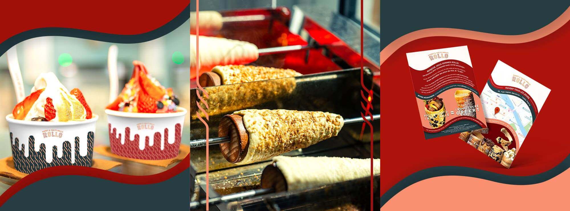
Moussa discovered “chimney cakes” during a visit to Prague in 2017. He fell in love with these buns that are cooked on a spit and are so popular in Eastern European countries (called “Truldo” in the Czech Republic and “Kurtos” in Hungary), and so he decided to import this fast food concept to the Latin Quarter of Paris which is very popular with tourists.
HE TALKED EXCLUSIVELY TO MADE FOR YOU ABOUT DEFINING THE STRATEGY OF THIS NEW CONCEPT, AS WELL AS ABOUT DEVELOPING ITS NAME AND ITS VISUAL IDENTITY.
After having developed the positioning strategy of the new restaurant (market analysis, brand platform), the team has brought the brand to life.
A VISUAL IDENTITY INSPIRED BY THE FOOD’S SHAPE
The market analysis of the “single-product” concept has taught us that the emphasis is put on originality and a fun dimension of the customer experience.
Furthermore, given the location of the new restaurant, in the heart of the Latin Quarter, this delicious food needed to be made accessible to passing tourists, to make it an alternative to other types of fast food available around it (kebab, etc.) and other traditional tourist restaurants.
Rather than highlighting the history of the chimney cake and saying that they are from Eastern European countries, the idea was, therefore, to make people (re)discover French cuisine in a different way, achieved through cooking this tasty batter on a spit in front of the customers and then filling it with savoury or sweet ingredients.
In France, food is sacred, but what is better than a concept that has come from somewhere else to desacralise it whilst showing it off at the same time ! Because the “French touch” is also the ability to take on as your own, and enhance, culinary traditions from around the world.
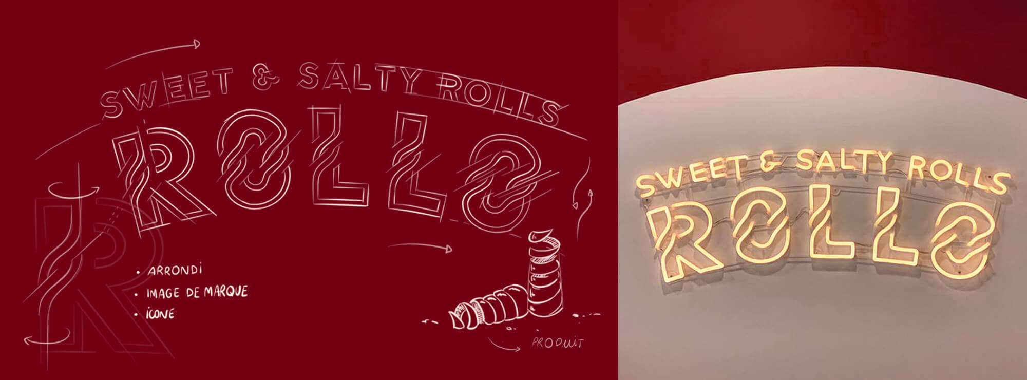
The name “Rollo” (from roll), as well as the twisted letters in the logo, therefore allude to this unique shape.
Its round shape and golden colour are inspired by the chimney cakes, highlighting how good they are.
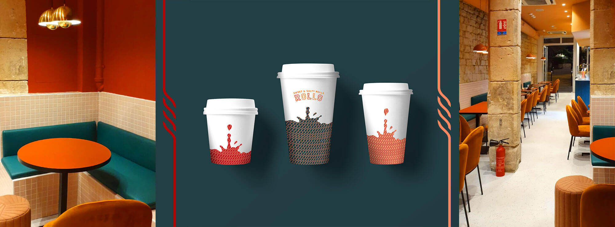
ADAPTING IDENTITY IN THE RESTAURANT
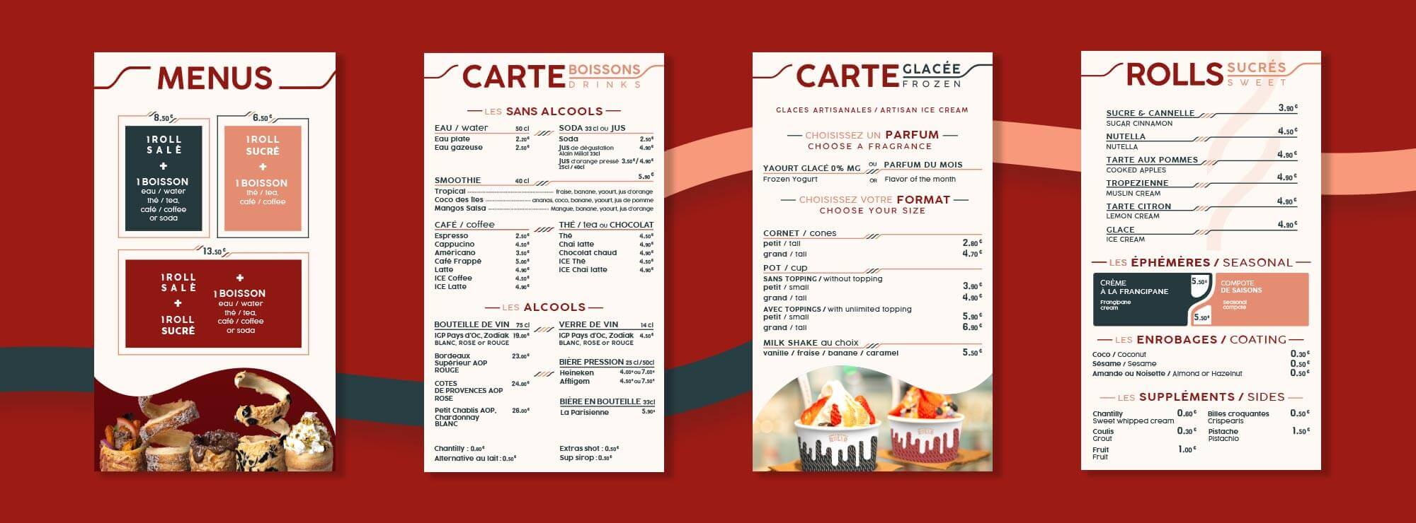
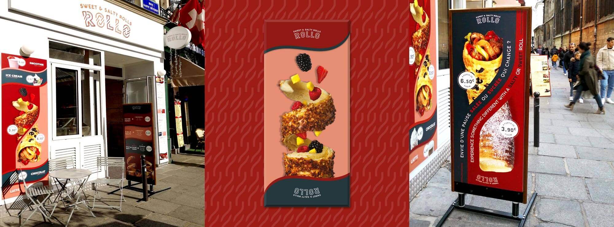
The twisted shape used in the logo’s letters creates a strong symbol of identity that we can find in the restaurant’s different communication platforms, such as the menus or the portable pavement sign.
The colours are also unique and warm, for a cosy place that is perfect for food lovers and which makes a change to the fast-food restaurants that lack soul and have garish colours that are found in the area.
However, without giving it an image of it being too upmarket, Rollo provides an alternative to traditional restaurants as tourists do not necessarily have the time to wait around between tours, and it also gives them the possibility of a rest with good food that is different to a regular snack.
