Yellow IT is a consulting firm specializing in new technologies, developing web and mobile solutions. Its consulting branch is committed to finding the necessary IT expertise within 48 hours, both in terms of hard and soft skills, ensuring a consultant who integrates seamlessly with the client’s team. Its "digital factory" branch supports these teams to maintain or evolve existing applications.
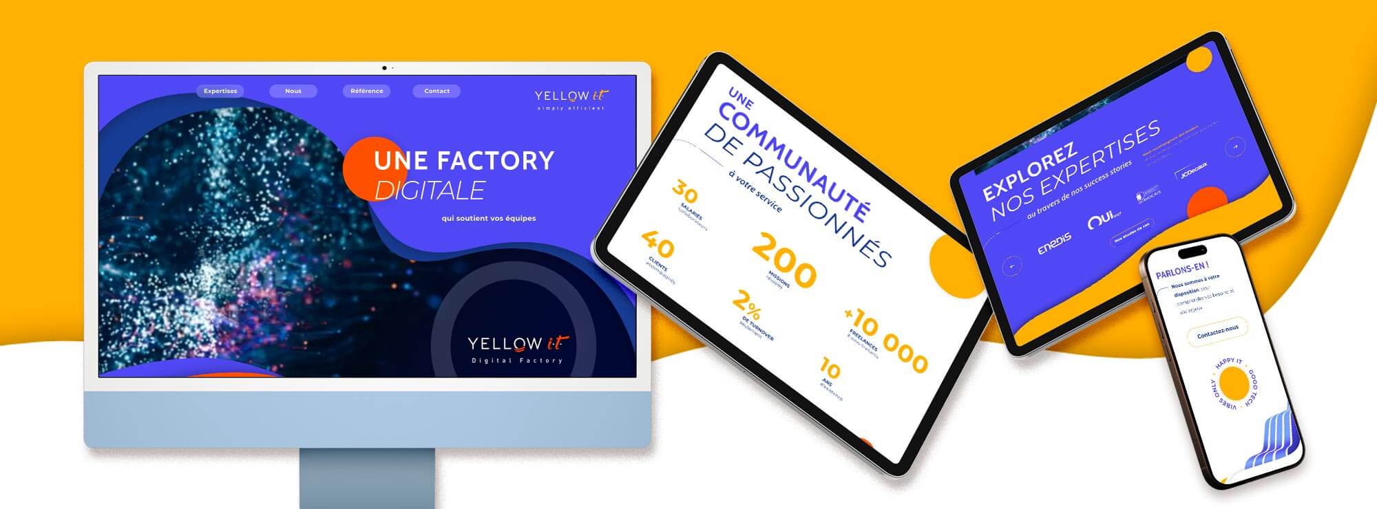
After the creation of the logo, Yellow IT also trusted us to create their new website, which better reflects their human approach to tech and their dynamism, in a typically classic and cold environment.
The alliance of human and technology
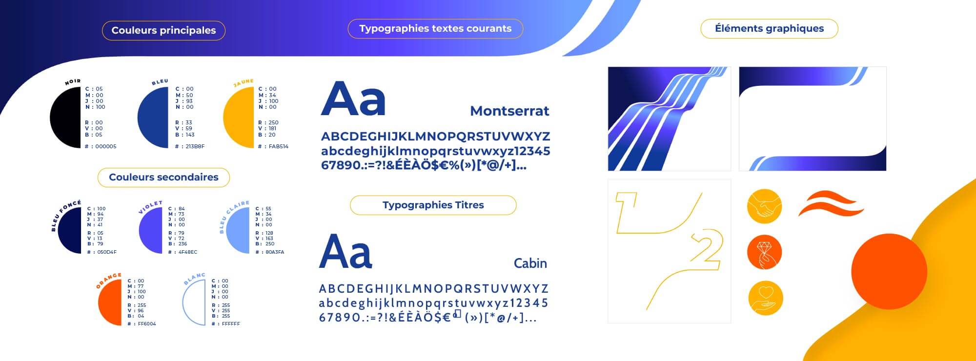
"Yellow IT" combines Yellow (positive, warm, and human) with IT (expertise, seriousness, and tech). The inversion of colors (Yellow in black and IT in yellow) symbolizes the company’s boldness. The handwritten typography of IT evokes the human aspect, paired with a sans serif font for Yellow, suggesting the tech and structured side. The inversion is also intentional. The waves represent movement, dynamism, and the idea of going with the flow, riding the wave. Positioned in front of the "O," they also resemble a sunrise, symbolizing renewal and optimism. The tagline "Simply efficient" conveys Yellow IT’s strengths (simplicity and efficiency). The company’s logo is adapted for the "digital factory" with arrows replacing the waves, illustrating the concepts of development, efficiency, and performance.
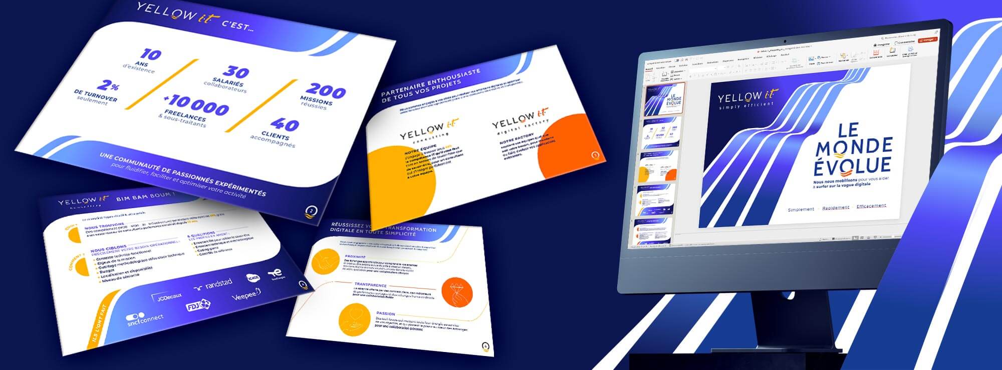
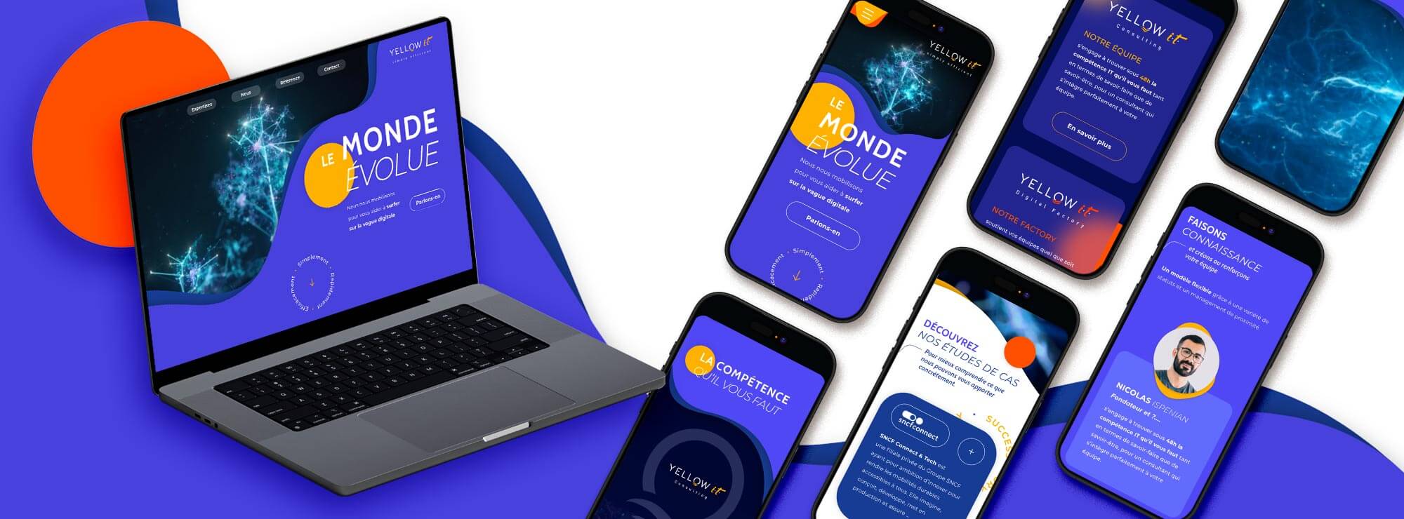
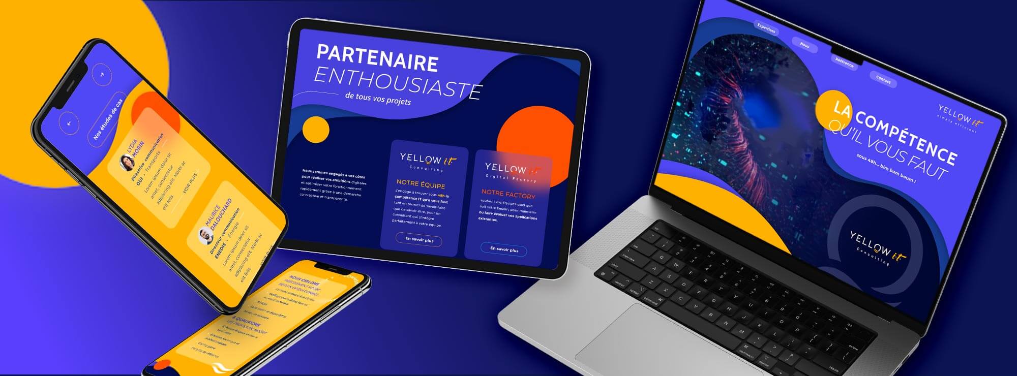
A creative and modern webdesign
While the previous website was traditional, the new one showcases the firm’s innovative capabilities through original graphics and smooth navigation (UX Design). The curves inspired by waves bring numerous moving shapes to life, symbolizing the team’s adaptability in an ever-changing digital world. The colors are vibrant and dynamic: yellow represents optimism and innovation, blue signifies trust, technology, and digital, and orange conveys the ideas of communication and action.
What our customer say
after working with us