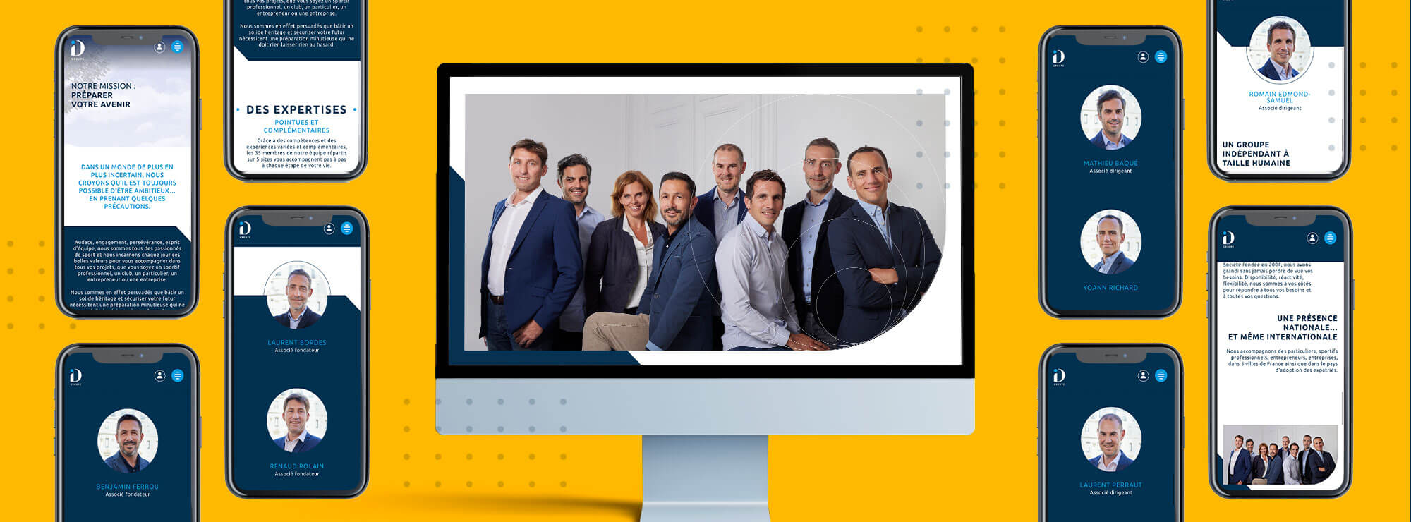
ID Patrimoine is an independent wealth management consultancy with 17 years of experience. Initially focused on professional athletes, the consultancy has expanded its services over the years to provide support for every aspect of its clients’ lives (assets, property, brokerage services, etc.), whether or not they are athletes. Having decided to target a more upmarket sector, the company was renamed and became Groupe ID. Consequently, its brand image no longer reflected its ambitious vision and the quality of its services. The group also created different websites for its various subsidiaries; this made it impossible to optimise their management and highlight their synergies.
Made for you was tasked with creating a unique website, bringing together these different areas of expertise to create a more coherent visual identity and more relevant messaging.


A more balanced logo
The design concept of the intertwined I and D continues to be relevant; it was therefore retained, but the typeface has been modernised (sans serif) and reworked for a unique result which features dynamic curves, rather than static shapes. To ensure greater coherence between the subsidiaries’ logos, the D is now dark blue (evoking stability and trust), while the colour of the dot over the I changes, depending on the subsidiary.
When turned upside down, the I becomes an exclamation mark, evoking the dynamism of the teams and the group, with its sporting DNA. It is used as a discreet background for the various communication materials. The typeface of the subsidiary names has also been modernised but still boasts a premium and dynamic style with its subtle curves, particularly evident in the letter R.


Symbolic and attractive photos
The new website has replaced the existing humorous illustrations with strongly symbolic photos; for instance, a photo of a tree evokes the idea of longevity and growth.
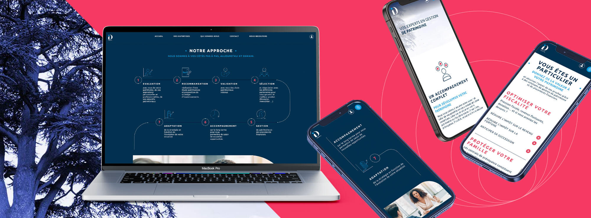
These photos have a blue tint, reinforcing the website’s premium feel. Other photos which emphasise personal support, one of the group’s key strengths, are carefully chosen in terms of their style and colour and are always in understated, bluish tones.


A more premium website
Dark blue is also used in large areas across the website, alternating with white to create a dynamism and reinforce the impression of quality. Sophisticated icons are created to illustrate key elements of the messaging.
The buttons and the photos at the top of the pages feature stronger, diagonally angled curves which reinforce this idea of expertise. The dot of the I also becomes a bullet point framing a title or subtle circles to add personality to the website’s photos. Combining circles and “hard” geometric shapes creates a balance between the ideas of personal support and high-level expertise.

