Created in 1985 by the general council, l’ACCET-Val d’Oise Technopole is a nonprofit association that reunites socio-economic actors, companies, financial institutions, consular chambers, and elected to the General Council.
Consisted of a team of about fifteen peoples, L’ACCET is a true ecosystem dedicated to innovation, entrepreneurship, and funding. They deploy, designs and animates 5 nurseries, 2 incubators, 1 hotel and 4 other technopoles sites.Their task is to accompany, and support start up companies, L’ACCET supported around 2000 startups since they were created and mobilizes around 5 million euros of financing every year. In 2019, l’ACCET-Val d’Oise Technopole creates an inspiring name: “StarLabs”.
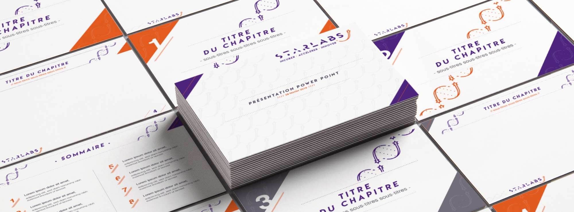
StarLabs called upon MADE FOR YOU to highlight their unique personality and their added value, throughout their visual identity.
A unique Typography
Thanks to StarLabs, young entrepreneurs can flourish and elaborates their own ideas, their projects. The typography of the logo grows little by little, from left to right, clearly illustrates that evolution.
The chosen colors, vehiculates the value of StarLabs : The purple to underline audacity, innovation and modernity. The orange relates to their dynamic creativity and optimism.
What our customer say
after working with us
A meaningful symbolic
The shooting stars re enforces the energy and the vitality of their support, making it possible for entrepreneurs to follow their dreams. The pattern composed of two shooting stars intertwined is used to showcase their communications supports, and give it extra “soul”.
It symbolizes their DNA, as every company is unique, like a human being whose cells multiplies.