 Brand strategyLogoVisual identityWebdesign
Founded in 1989, Gira became a leader in the “Away from home” consumption trends. Established specialist in marketing strategies for all kinds of foods and catering, Gira provides guidance in a comprehensive and long-lasting way, as well as accompanying them in their requirements: All crew members are well adjusted to the field, and are constantly observing the consumers and how their habits may change.
THE AGENCY CALLED UPON “MADE FOR YOU” TO ACCOMPANY THEM IN MODERNIZING THEIR BRAND IMAGE. FROM THEIR LOGO
TO THEIR WEBSITE, THEY WANTED THEIR NEW IMAGE TO TRULY REFLECT THEIR STRENGTHS AND THEIR UNIQUE PERSONALITY
Firstly, the agency proceeded to an analysis of the consulting market and the development of hotels and restaurants, as well as a completing an audit of their current communication strategies, to truly understand their current identity.
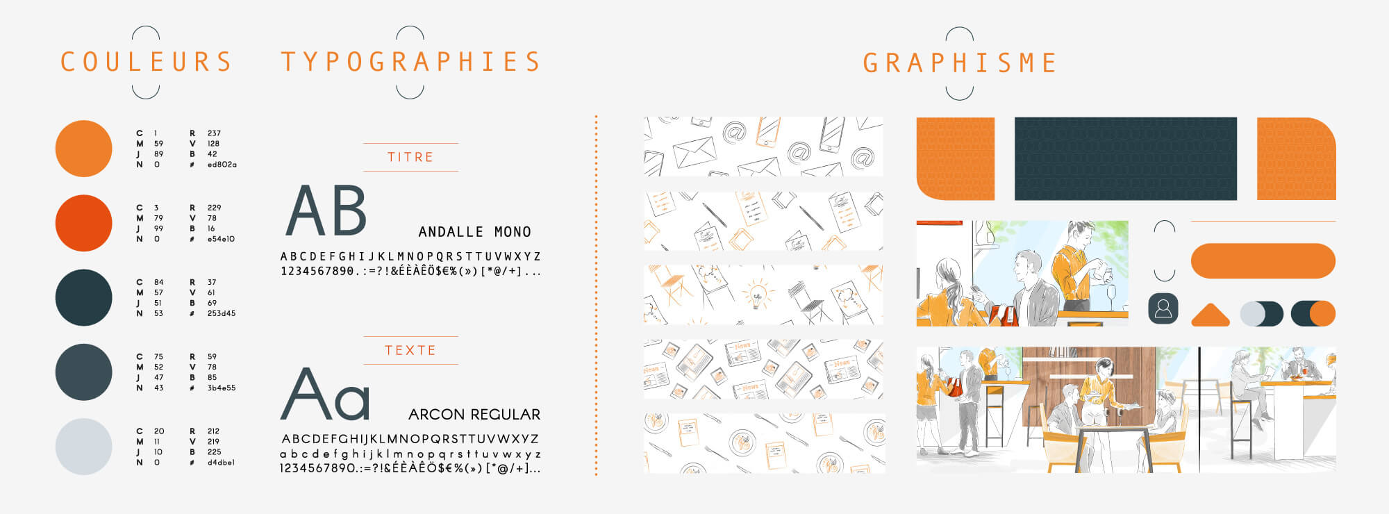
VISUAL IDENTITY
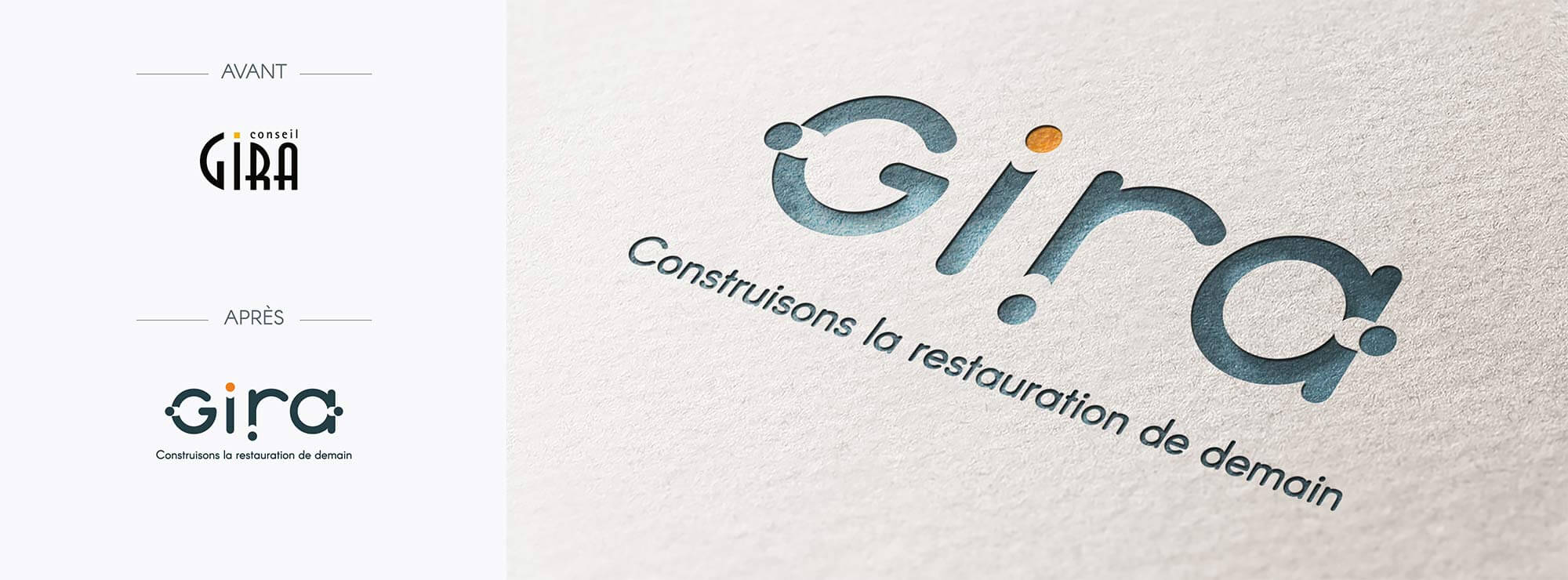
The logo we imagined evokes the assistance they provide their clients, illustrated by the 4 minimalist dots, referencing the 4 cardinal points. It gives a feel of orientation. They are used to underline the 360° angle, the way GIRA, truly accompanies their clients. The also represent the « on and off buttons » that one would use to turn on the “innovation idea button” Finally, the movement going from the inside out evokes the dynamic at the effervescence of ideas.
The Gira font is round and in small caps, to make to logo more accessible and friendly. The baseline "Build tomorrow’s catering" allows the client to have a clear idea of what GIRA does as well as their added value.
• Build : Accompaniment + long term • Restoration / catering : Activity • Build for tomorrow : Innovative
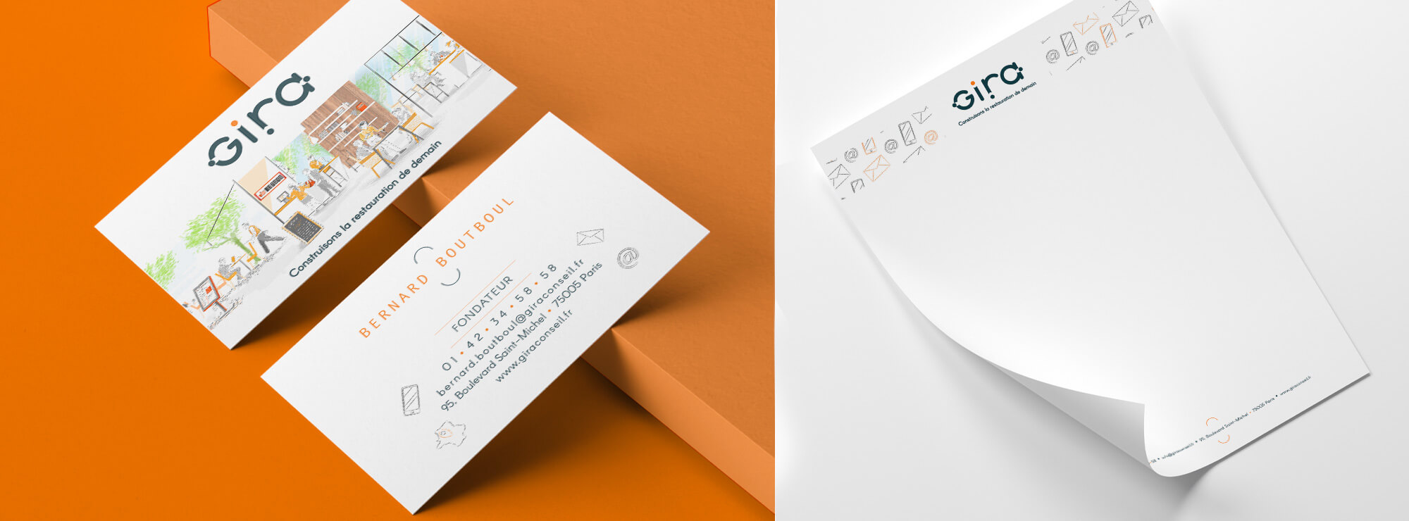
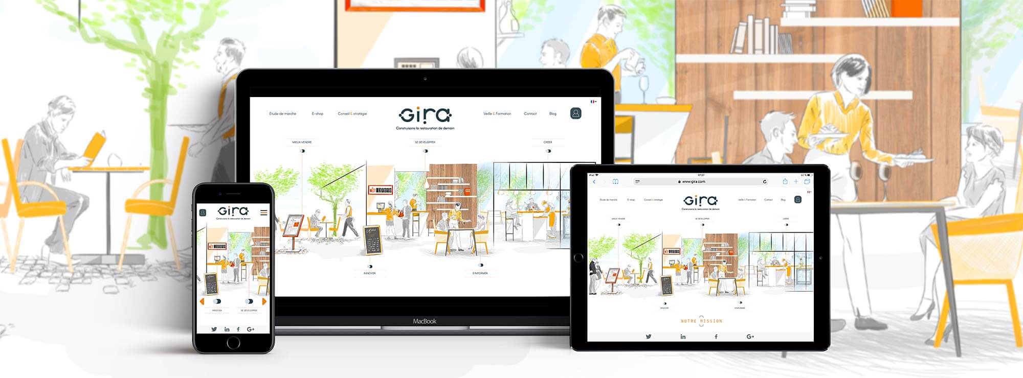
WEBSITE
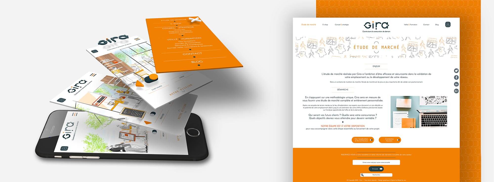
The homepage is designed to highlight the personalized accompaniment that Gira offers to the restaurateurs , by illustrating every key moment of that journey they embark on with their clients : “Communicate, create, expand, innovate, divest”.
The agency offers a number of solutions, counsel as well as custom made = training programs for their clients. The style of the illustration, line drawn, refers to the stokes of an architect designing a new project or expanding an old one.
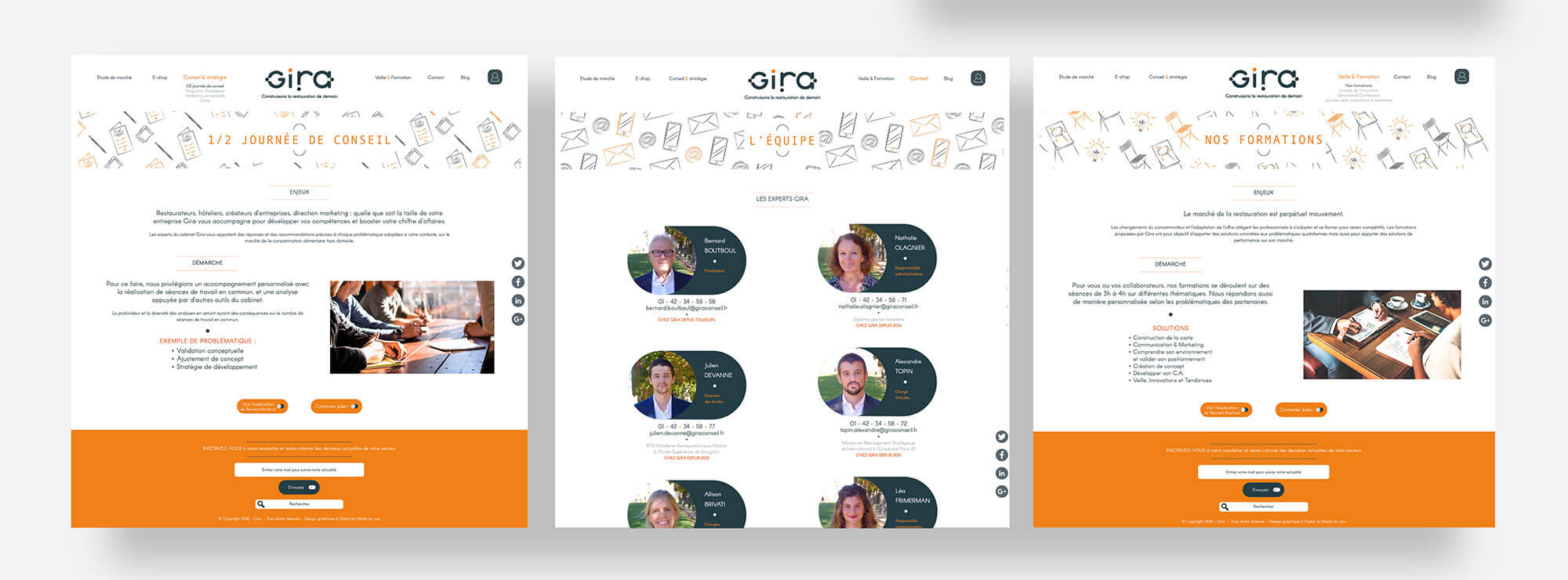
Every page of the website are associated with illustrations designed to represent the offer (hand drawn like the homepage) localization for the market study, paperboard ad chair for the training program, pens and notebooks for the counsel, telephone, email and mail for the crew.
The « on and off button » of the logo is re used several times on real buttons, and on the page introducing the crew. It is meant to attract they eye and make the experience of navigating on their site interactive. The entire website has been designed to fit mobile
phones in order to make navigation easy.
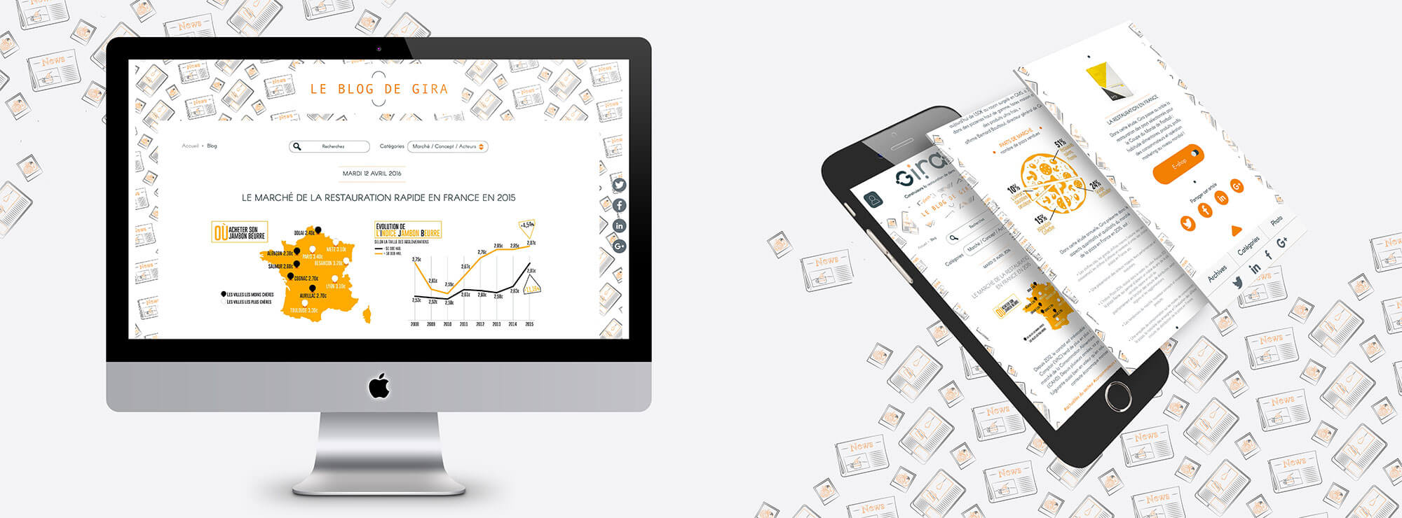
The interphase of Gira’s blog was not interactive enough. We made sure that it would be optimal.
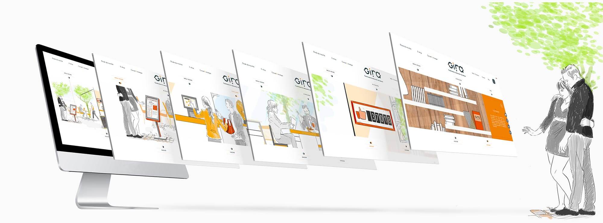
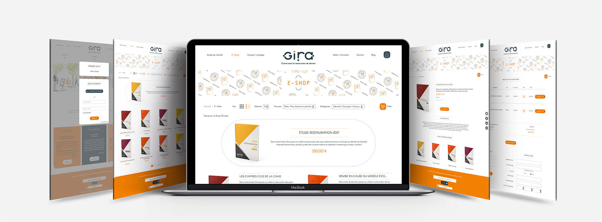
E-SHOP & BLOG
A all previous pages, every "product" on sale on the e-shop and every article present on the blog, has its own illustration on the top page.
