for LOGO AND WEBSITE DESIGN
As a specialist in high-precision fine sheet metalwork for industrial clients for more than 35 years, ATAB provides a comprehensive service, working on projects for clients from the railway, aeronautical, space, automotive and defence industries, whatever their needs.
ATAB asked Made for you to create a new brand identity and to redesign its website.
After carrying out market analysis and brand repositioning work to clarify ATAB’s strengths and distinguishing features, the team created a new logo and a new signature, in addition to producing a brochure and redesigning the company’s existing website.
A powerful and unique promise
During the initial strategic phase of the project, a distinctive fundamental element emerged: ATAB‘s incredible professionalism when working with its clients, which goes hand in hand with the highly specialised expertise and commitment of the company’s staff.
The virtuous circle
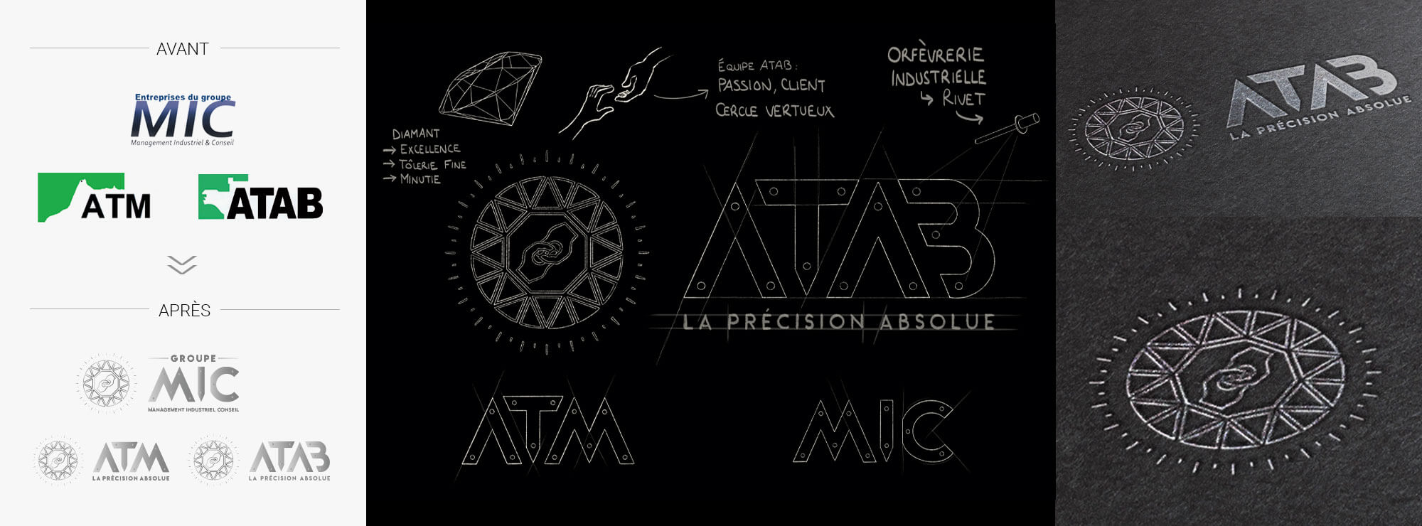
This is a virtuous circle, combining people, values, technical mastery and machines, which ensures the high-end and bespoke service expected of gold and silversmithing.
In this way, we chose to position ATAB as a representative of “industrial gold and silversmithing”. This bold symbolism and distinctive positioning were a source of real creativity for us.
A logo which combines a focus on people and expertise
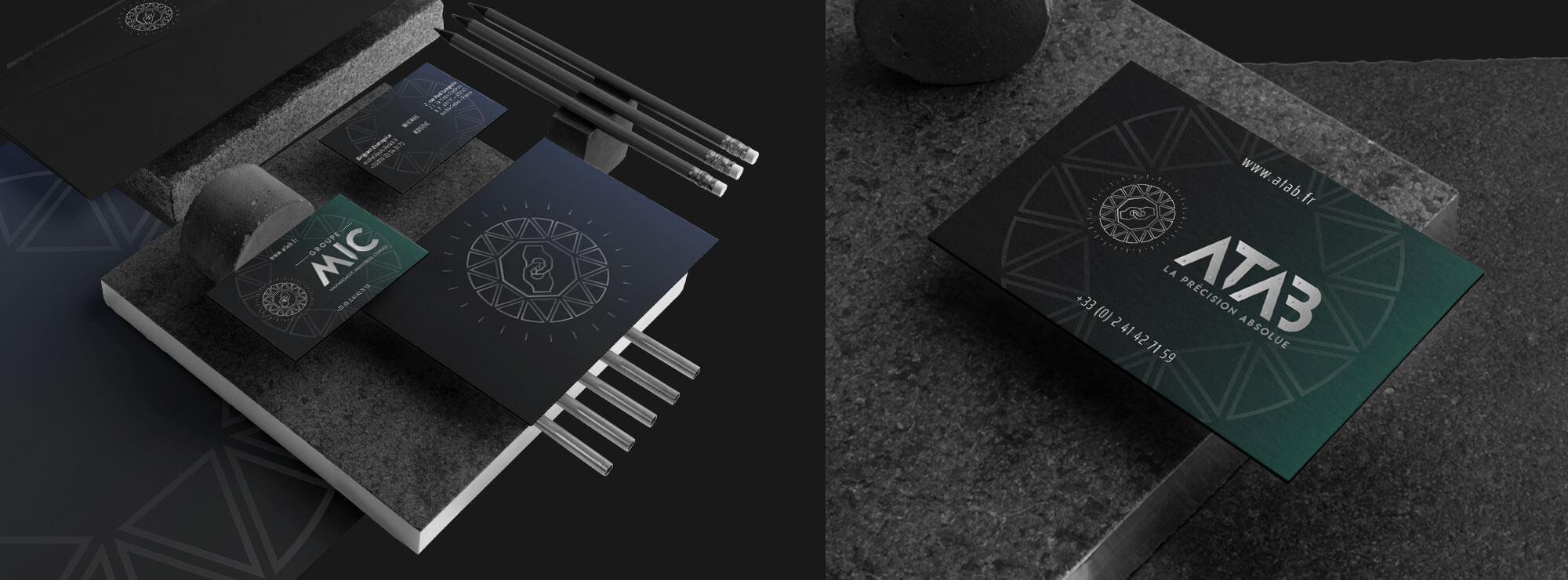
We therefore chose to create an acronym with subtle references to gold and silversmithing, jewellery and its high-precision nature, using a sparkling diamond as inspiration, while linking it to elements which are specific to ATAB’s industry, including a cog and a nut.
To emphasise the company’s people-oriented focus and its passion for performance, we added two hands joined together like a wrench in the centre. In addition to this, the brand name has also been designed with a modernity and technical feel, emphasised by its steel look.
Lastly, we came up with a new baseline which clearly summarises ATAB’s ambitious, committed and high-quality positioning: “Absolute precision”.
Coherent and unified communication tools
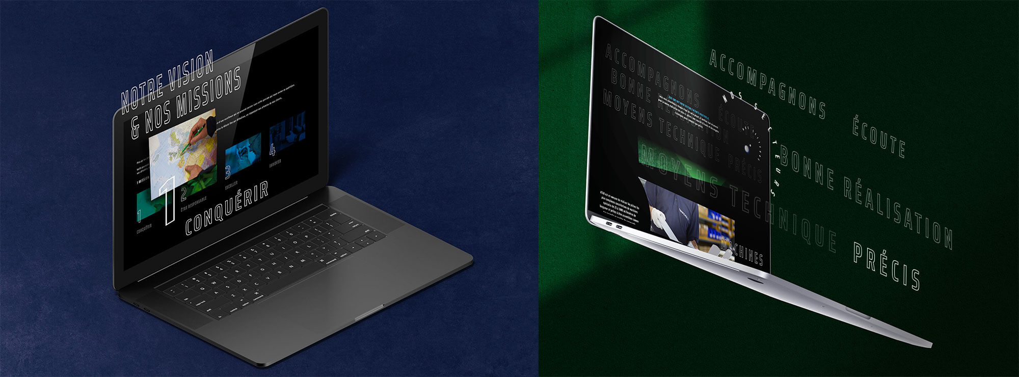
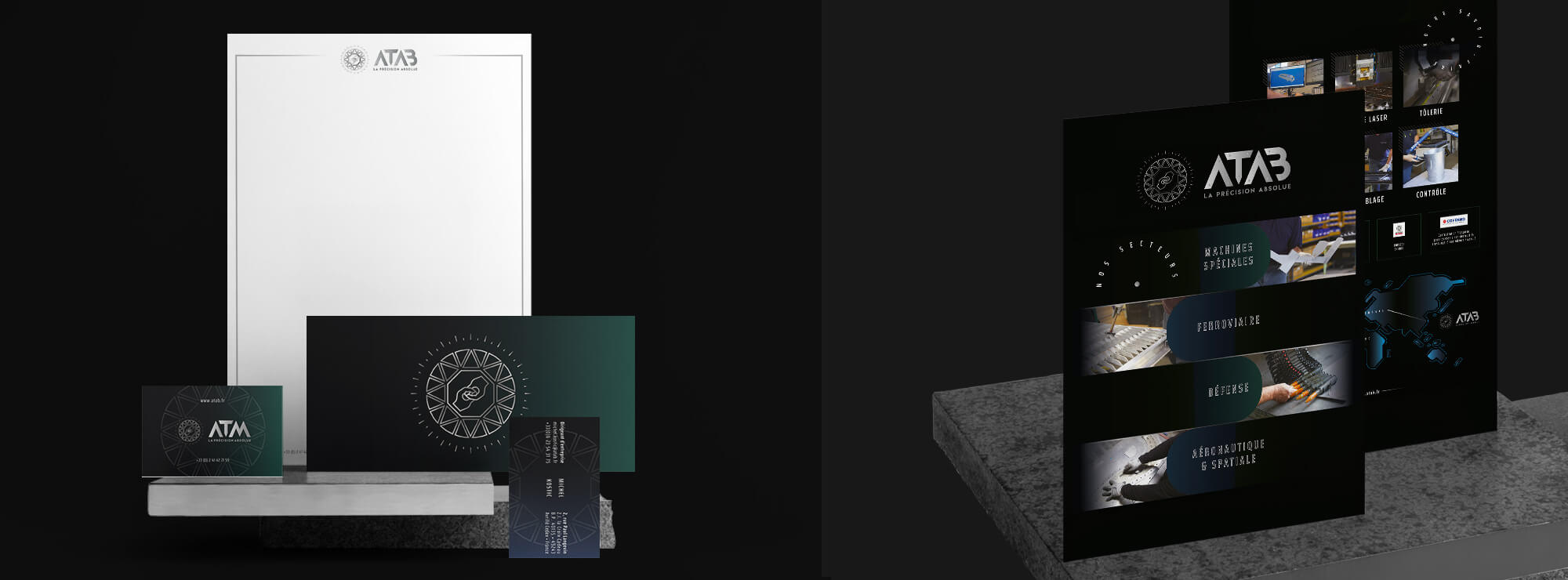
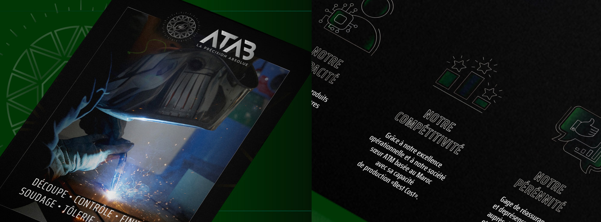
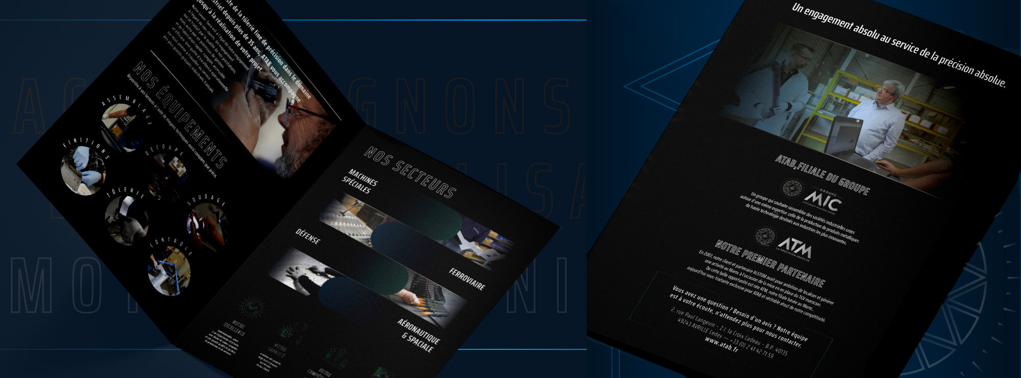
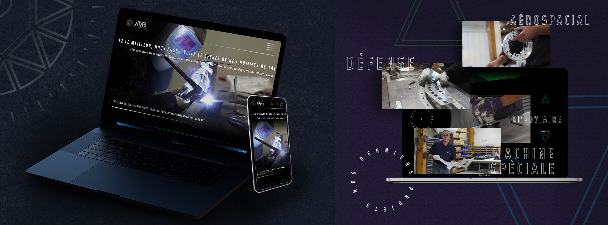
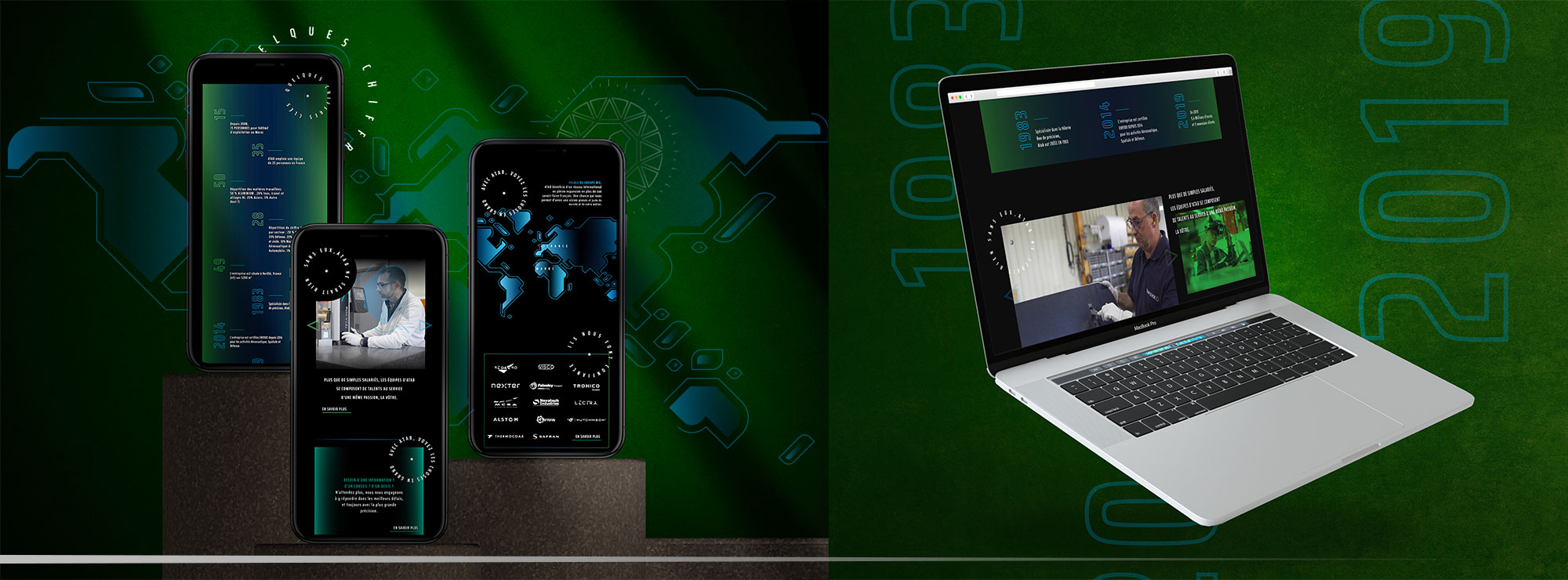
To further develop ATAB’s new positioning, we designed communication materials which reflect the company’s graphic identity and redesigned website.
An inspiring, symbolic site
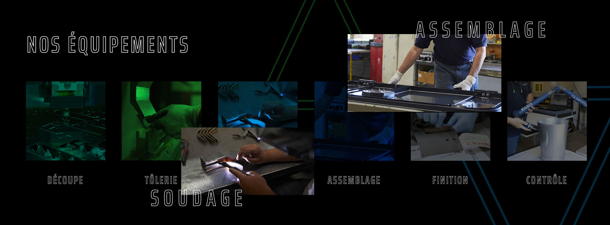
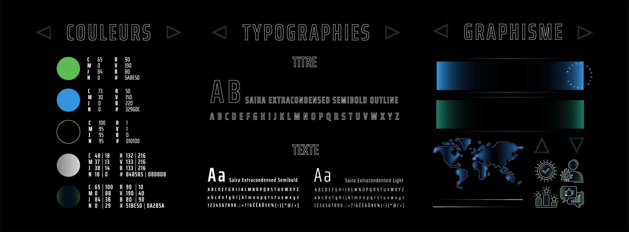
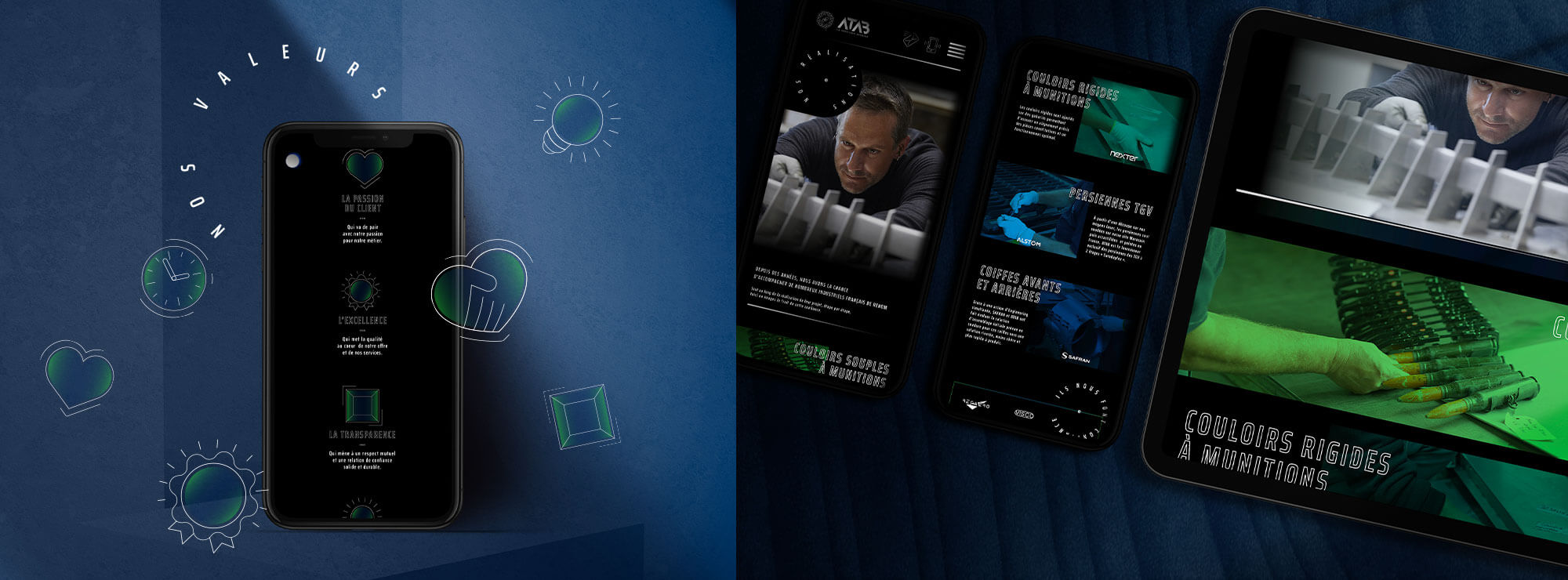
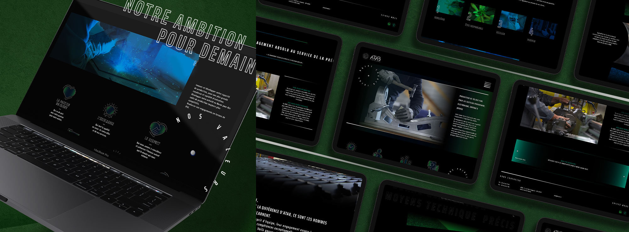
To translate this new positioning and graphic identity and to underline the brand’s appeal and ability to innovate, we opted for a design which is modern, visual, people-oriented, dynamic and interactive. This modern style is created with the use of a black background and a symbolic font which evokes one of ATAB’s areas of expertise (cutting out) and which differs from those used by the competition.
The dynamic feel is the result of simplified, smooth and streamlined navigation and numerous images which emphasise the brand’s technical mastery and innovation. Last but not least, we chose to add visuals of human beings to embody the brand, its values and its commitment.
