for LOGO
A client of Made for you, the French Development Agency (AFD in French) has worked for more than 70 years to fight poverty, to promote development in southern countries and to support the economic and social momentum of overseas territories.
Through grants, loans, guarantee funds, debt relief and development contracts, it funds projects, programmes and studies and helps its partners to strengthen their capacities.
Its Pacific Initiative (the initial name given to the project before our involvement) is a French and European project which brings together a coalition of international backers (Australia, Canada, New Zealand) to establish a funding window, focused on climate change adaptation and biodiversity in 18 Pacific territories (most of which are islands).
The AFD asked Made for you to create the initiative’s identity, along with a brochure presenting the initiative
After benchmarking similar existing projects, the team established the initiative’s brand platform to structure the key messages to be shared and to come up with a striking name and logo.

A hugely symbolic name
The recommended strategy was to highlight the joint undertaking of the initiative’s various backers which provide local and international grants and subsidies for a “one-stop shop” to promote green solutions for biodiversity conservation and climate resilience.
The name which was chosen at the end of this multiple-stage project, Kiwa, touches on several different key ideas:
- Kiwa is one of the male guardians of the ocean in the traditions of some Māori tribes of the North East of New Zealand: Kiwa had 2 wives, Parawhenuamea (the ancestor of streams) and Hinemoana (the personification of the ocean). Kiwa and Hinemoana had 10 children, all connected to the marine ecosystem (shellfish, seaweed, eels, etc.).
- One of the poetic names for the Pacific Ocean is “Te moana nui a Kiwa” (Kiwa’s large ocean).
- Kiwa is also the goddess of mother-of-pearl and shellfish in Polynesian mythology.
- Lastly, the Kiwa Hirsuta or the “yeti crab” is a crab which lives in the depths of the South Pacific, first discovered in 2005.
Kiwa is therefore a strong symbol of protection for the Pacific Ocean’s ecosystems and biodiversity and provides a wealth of storytelling opportunities for this project.
The French name “Initiative Kiwa” and the English name “Kiwa Initiative” are equally easy to pronounce, something which was of particular importance.
The baseline (“nature-based solutions for climate resilience”) sums up the initiative’s mission.

A harmonious logo
Although Kiwa is a god (or a goddess), the agency made the choice not to “personify” him/her in the logo and therefore not to illustrate him/her with a face to promote collaboration rather than the idea of a single force and to avoid gendering this “energy” which is being used to encourage climate change adaptation.
However, the hands evoke the god/goddess Kiwa, providing a way to get around these issues while also symbolizing the protection of financial backers and all the people involved in the initiative, whoever they are (project leaders, local populations, etc.).
The circle is dynamic and evokes the planet and the balanced ecosystem which must be developed, like the yin and yang which are replaced here by green leaves (representing plant biodiversity on land) and blue droplets (which evoke the biodiversity of the relevant territories’ oceans).
The typography for Kiwa has a flexibility to it, evoking dynamism, the living world and the waves.
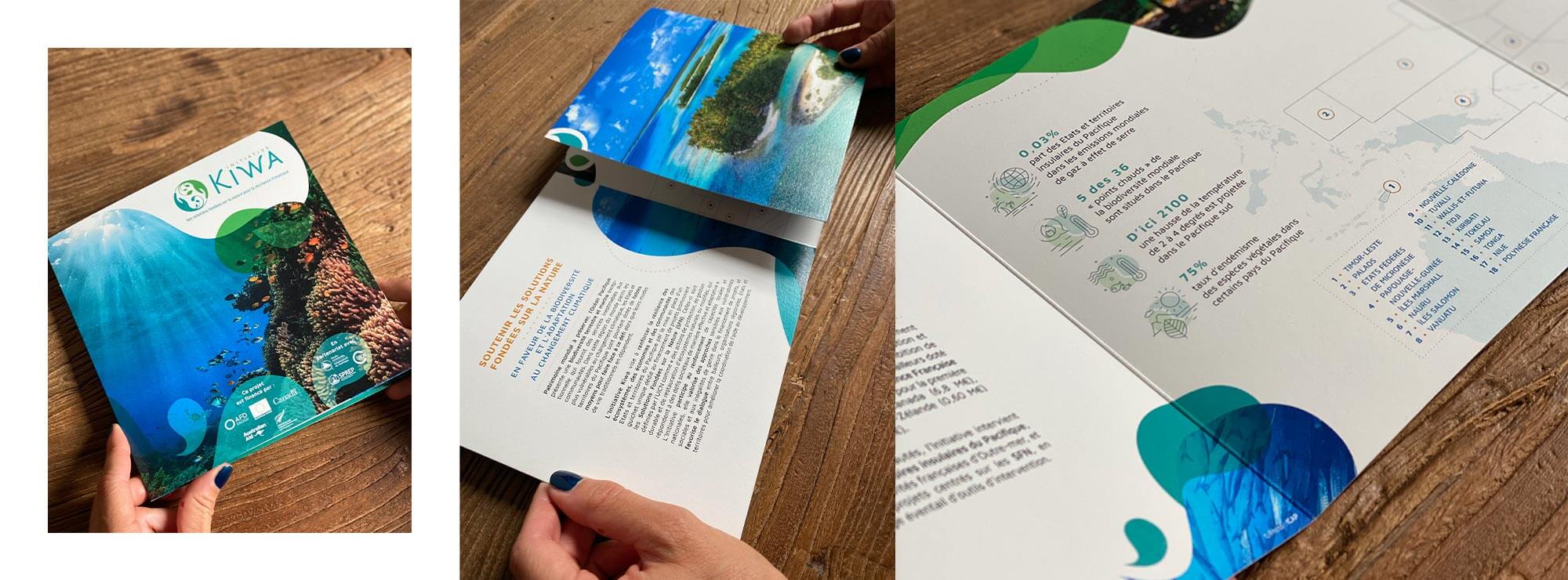

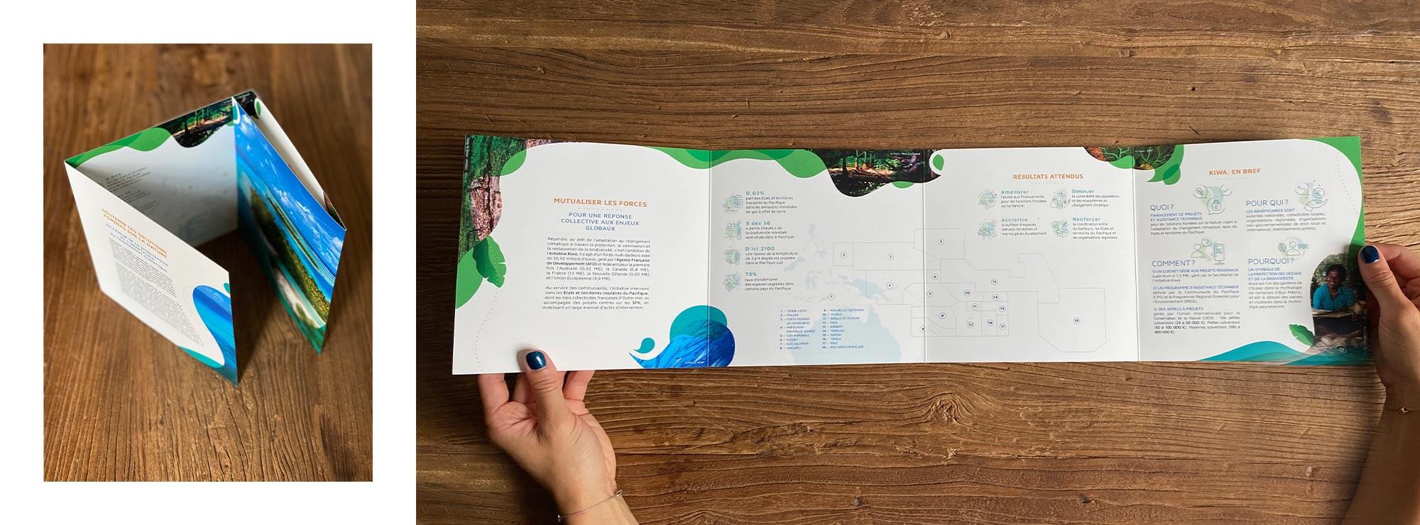
Printed media with a very visual focus
Documents which present public projects are usually very complex, technical and unappealing.
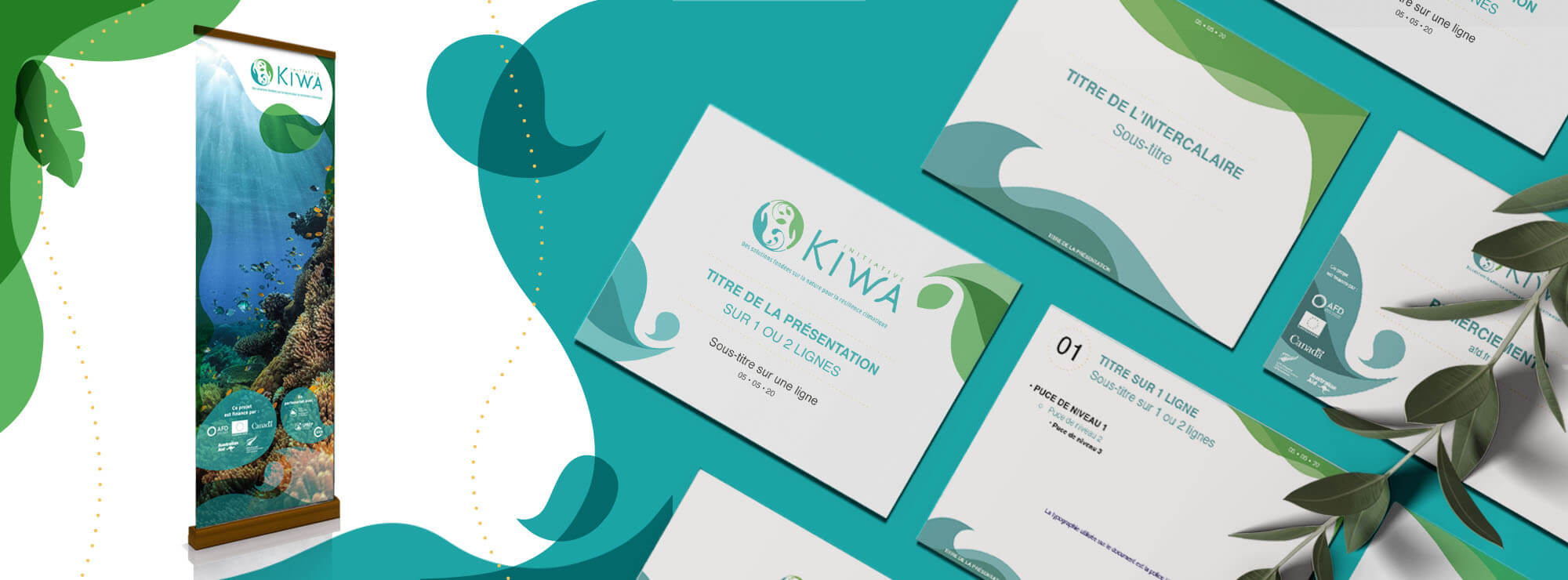
After analysing the expectations of various target audiences (and bearing in mind that the general public was a secondary target) and after establishing a communication strategy for the initiative, the agency produced particularly visual communication materials (including stationery, vertical hanging banners, a brochure, a PowerPoint presentation, etc.).
These materials simply and effectively explain the initiative and how it works and visually represent the idea of a balance between the earth (above in green) and the ocean (below in blue), along with photographs of the oceans to emphasise the initiative’s genuine focus on the natural world.